Website Header with Slider HTML, CSS & JavaScript Tutorial
Website Header with Slider HTML, CSS & JavaScript Tutorial
Website Header with Slider HTML, CSS & JavaScript Tutorial

Overview
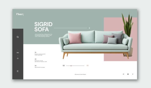
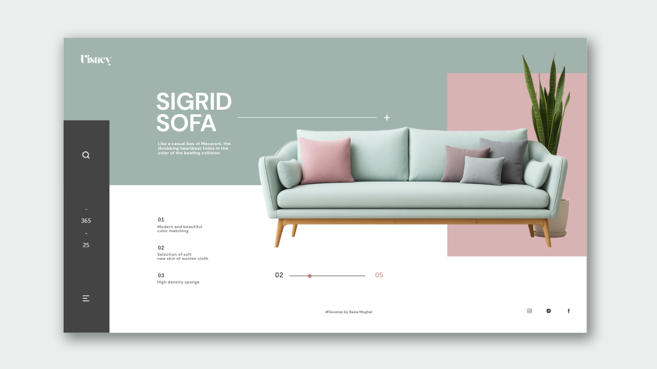
This project is a conceptual website for a modern furniture brand that features an attractive sofa collection with an animated sidebar navigation, simple slide-based transitions, and a dynamic background color change when selecting items or moving to the next image of interest.
Project Structure
Before we begin, create the following file structure:
sidebar sofa website/
│
├── index.html
├── style.css
├── script.js
└── images/
├── 1.png
├── 2.png
├── 3.png
├── 4.png
├── 5.png
└── logo.png
🧱 Step 1: Page Layout
The structure is all in flexbox and grid, dividing the page into three main areas:
- Sidebar – a vertical navigation with icons and brand information.
- Main Hero Section – including text, features, and images of the product.
- Footer – including credit text and social media icons.
The background employs a split color gradient (linear-gradient) that transitions smoothly as you go through the slides.
🧱 Step 2: Sidebar Design
The sidebar, fixed vertically on the left, includes:
- A search icon
- A vertical counter (365 / 25 decorative)
- A menu icon
These icons are based on Remix Icons and are styled to have hover states for smooth interaction.
<aside class=”sidebar”>
<i class=”ri-search-line icon”></i>
<div class=”middle”>-<br>365<br>-<br>25</div>
<i class=”ri-menu-2-line icon”></i>
</aside>
🧱 Step 3: Hero Section
This section presents:
- The primary title
- A divider line
- A brief subtitle description
- A list of three attributes that describe sofa quality
Each of the attributes are numbered and formatted with slight positioning for animation effects.
<h1 class=”title”>Sidebar <br> Sofa</h1>
<div class=”divider”></div>
<p class=”subtitle”>
Lorem ipsum dolor sit amet consectetur adipisicing elit…
</p>
🧱 Step 4: Product Showcase with Color Transitions
The main feature of this site is the sofa slider, which is simply created with five product images positioned absolutely and layered on top of each other, with only one sofa showing at a time. When you click on the slider control, the next sofa fades and scales in, including the following actions:
<div class=”product-wrap”>
<div class=”block”></div>
<img src=”images/1.png” class=”sofa active”>
<img src=”images/2.png” class=”sofa”>
<img src=”images/3.png” class=”sofa”>
<img src=”images/4.png” class=”sofa”>
<img src=”images/5.png” class=”sofa”>
</div>
- The gradient background color changes.
- The accent block color changes.
- The indicator circle moves effortlessly across the progress bar.
This produces a connected, smooth motion that appears professional and feels interactive.
🧱 Step5: JavaScript Slider Logic
An efficient and brief script manages functionality:
- Every click will cycle through the sofas, through the array in order.
- The color used for both the background and each block varies dynamically.
- The circular indicator glides along the progress line.
Main JS Code:
const sofas = document.querySelectorAll(‘.sofa’);
const indicator = document.getElementById(‘indicator’);
const currentSlide = document.getElementById(‘currentSlide’);
const page = document.querySelector(‘.page’);
const Block = document.querySelector(‘.block’);
let index = 0;
const colorPairs = [
[“#9aaea6”, “#d7968f”],
[“#c4e6e0”, “#cb9fb3”],
[“#4b2c3f”, “#447069”],
[“#dea331”, “#133b5b”],
[“#065570”, “#a0656c”]
];
function showSlide(i){
sofas.forEach((sofa,idx)=>{
sofa.classList.remove(‘active’);
if(idx===i){sofa.classList.add(‘active’);}
});
currentSlide.textContent = (i+1).toString().padStart(2,’0′);
const step = 340 / 4;
indicator.style.transform = `translateX(${i*step}px)`;
const [bg, accent] = colorPairs[i];
page.style.background = `linear-gradient(${bg} 45%, white 45%)`;
Block.style.background = accent;
indicator.style.background = accent;
index = i;
}
document.getElementById(‘slider’).addEventListener(‘click’,()=>{
let next = (index+1)%sofas.length;
showSlide(next);
});
showSlide(0);
This code enables the website to be fully interactive without an external animation library, and provides simple yet dynamic transitions.
🧱 Step6: Footer & Social Links
The footer includes:
- Attribution to the developer
- Animated social media icons that raise and glow on hover.
<footer>
<div class=”center”>#develop by Razia Mughal</div>
<div class=”social”>
<i class=”ri-facebook-fill”></i>
<i class=”ri-twitter-fill”></i>
<i class=”ri-instagram-fill”></i>
</div>
</footer>
✨ Features
- Fully Responsive Layout – Works exactly the same across different screen sizes.
- Dynamic Color Transition – Different background and accent color combinations per slide.
- Sleek Sidebar Navigation – Simple vertical layout with interaction to the icons.
- Animated Product Slider – Images slide with scaling transition.
- Pure JavaScript – No dependencies, clean and simple logic.
- Hover Effects – Subtle animations of icons and buttons.
🧩 Technologies Used
- HTML5 – Semantic structure for layout
- CSS3 – Root variables, flexbox, transitions, gradients
- JavaScript (ES6) – Interactive addition for slider
- Remix Icons – Design modern icon set for the UI design
This project is well suited for:
- Portfolio website, furniture and or interior design
- Showcasing products, or visual tutorial animations
- YouTube tutorial explaining step by step logic of UI design
Design Synth
Welcome to Design Synth! Enter the world of web design, where art meets code. Find awesome designs, practice new techniques, and churn out stunning digital experiences that excite and engage an audience.
Popular Posts

Explore Topics

- Card Design (4)
- Carousel (2)
- CSS and HTML (10)
- Design Synth (11)
- Form Designs (1)
- GSAP (4)
- Header Design (8)
- Hover Effect (4)
- JavaScript (9)
- Navbar Designs (4)
- Parallax (1)
- Slider Designs (2)
- Template Designs (3)
- WordPress (1)
Tag Clouds

- Animation Effects
- Animation Image
- Animation Text
- AOS Animation
- Button
- Card Design
- Cards Design
- Carousel
- Code Tutorials
- Creative Web Templates
- CSS and HTML
- Design Synth
- Effect Image
- Effect Scroll
- Form Design
- Form Designs
- Free Website Template
- Front-End Design
- Glassmorphism Design
- GSAP Animation
- Halloween
- Header Design
- Hover Effects
- HTML
- HTML CSS Projects
- JavaScript
- JS
- Modern Website Design
- Navbar Design
- Navbar Designs
- Parallax Effect
- Parallax Scroll CSS
- Plane Website
- Responsive
- Responsive Design
- Slider Design
- Slider Designs
- SVG
- Tailwind CSS
- Template Designs
- UI Design
- UX Design
- Web Design
- Web Development
- Website Templates
- WordPress Website

Overview
This project is a conceptual website for a modern furniture brand that features an attractive sofa collection with an animated sidebar navigation, simple slide-based transitions, and a dynamic background color change when selecting items or moving to the next image of interest.
Project Structure
Before we begin, create the following file structure:
sidebar sofa website/
│
├── index.html
├── style.css
├── script.js
└── images/
├── 1.png
├── 2.png
├── 3.png
├── 4.png
├── 5.png
└── logo.png
🧱 Step 1: Page Layout
The structure is all in flexbox and grid, dividing the page into three main areas:
- Sidebar – a vertical navigation with icons and brand information.
- Main Hero Section – including text, features, and images of the product.
- Footer – including credit text and social media icons.
The background employs a split color gradient (linear-gradient) that transitions smoothly as you go through the slides.
🧱 Step 2: Sidebar Design
The sidebar, fixed vertically on the left, includes:
- A search icon
- A vertical counter (365 / 25 decorative)
- A menu icon
These icons are based on Remix Icons and are styled to have hover states for smooth interaction.
<aside class=”sidebar”>
<i class=”ri-search-line icon”></i>
<div class=”middle”>-<br>365<br>-<br>25</div>
<i class=”ri-menu-2-line icon”></i>
</aside>
🧱 Step 3: Hero Section
This section presents:
- The primary title
- A divider line
- A brief subtitle description
- A list of three attributes that describe sofa quality
Each of the attributes are numbered and formatted with slight positioning for animation effects.
<h1 class=”title”>Sidebar <br> Sofa</h1>
<div class=”divider”></div>
<p class=”subtitle”>
Lorem ipsum dolor sit amet consectetur adipisicing elit…
</p>
🧱 Step 4: Product Showcase with Color Transitions
The main feature of this site is the sofa slider, which is simply created with five product images positioned absolutely and layered on top of each other, with only one sofa showing at a time. When you click on the slider control, the next sofa fades and scales in, including the following actions:
<div class=”product-wrap”>
<div class=”block”></div>
<img src=”images/1.png” class=”sofa active”>
<img src=”images/2.png” class=”sofa”>
<img src=”images/3.png” class=”sofa”>
<img src=”images/4.png” class=”sofa”>
<img src=”images/5.png” class=”sofa”>
</div>
- The gradient background color changes.
- The accent block color changes.
- The indicator circle moves effortlessly across the progress bar.
This produces a connected, smooth motion that appears professional and feels interactive.
🧱 Step5: JavaScript Slider Logic
An efficient and brief script manages functionality:
- Every click will cycle through the sofas, through the array in order.
- The color used for both the background and each block varies dynamically.
- The circular indicator glides along the progress line.
Main JS Code:
const sofas = document.querySelectorAll(‘.sofa’);
const indicator = document.getElementById(‘indicator’);
const currentSlide = document.getElementById(‘currentSlide’);
const page = document.querySelector(‘.page’);
const Block = document.querySelector(‘.block’);
let index = 0;
const colorPairs = [
[“#9aaea6”, “#d7968f”],
[“#c4e6e0”, “#cb9fb3”],
[“#4b2c3f”, “#447069”],
[“#dea331”, “#133b5b”],
[“#065570”, “#a0656c”]
];
function showSlide(i){
sofas.forEach((sofa,idx)=>{
sofa.classList.remove(‘active’);
if(idx===i){sofa.classList.add(‘active’);}
});
currentSlide.textContent = (i+1).toString().padStart(2,’0′);
const step = 340 / 4;
indicator.style.transform = `translateX(${i*step}px)`;
const [bg, accent] = colorPairs[i];
page.style.background = `linear-gradient(${bg} 45%, white 45%)`;
Block.style.background = accent;
indicator.style.background = accent;
index = i;
}
document.getElementById(‘slider’).addEventListener(‘click’,()=>{
let next = (index+1)%sofas.length;
showSlide(next);
});
showSlide(0);
This code enables the website to be fully interactive without an external animation library, and provides simple yet dynamic transitions.
🧱 Step6: Footer & Social Links
The footer includes:
- Attribution to the developer
- Animated social media icons that raise and glow on hover.
<footer>
<div class=”center”>#develop by Razia Mughal</div>
<div class=”social”>
<i class=”ri-facebook-fill”></i>
<i class=”ri-twitter-fill”></i>
<i class=”ri-instagram-fill”></i>
</div>
</footer>
✨ Features
- Fully Responsive Layout – Works exactly the same across different screen sizes.
- Dynamic Color Transition – Different background and accent color combinations per slide.
- Sleek Sidebar Navigation – Simple vertical layout with interaction to the icons.
- Animated Product Slider – Images slide with scaling transition.
- Pure JavaScript – No dependencies, clean and simple logic.
- Hover Effects – Subtle animations of icons and buttons.
🧩 Technologies Used
- HTML5 – Semantic structure for layout
- CSS3 – Root variables, flexbox, transitions, gradients
- JavaScript (ES6) – Interactive addition for slider
- Remix Icons – Design modern icon set for the UI design
This project is well suited for:
- Portfolio website, furniture and or interior design
- Showcasing products, or visual tutorial animations
- YouTube tutorial explaining step by step logic of UI design
Design Synth
Welcome to Design Synth! Enter the world of web design, where art meets code. Find awesome designs, practice new techniques, and churn out stunning digital experiences that excite and engage an audience.
Popular Posts

Explore Topics

- Card Design (4)
- Carousel (2)
- CSS and HTML (10)
- Design Synth (11)
- Form Designs (1)
- GSAP (4)
- Header Design (8)
- Hover Effect (4)
- JavaScript (9)
- Navbar Designs (4)
- Parallax (1)
- Slider Designs (2)
- Template Designs (3)
- WordPress (1)
Tag Clouds

- Animation Effects
- Animation Image
- Animation Text
- AOS Animation
- Button
- Card Design
- Cards Design
- Carousel
- Code Tutorials
- Creative Web Templates
- CSS and HTML
- Design Synth
- Effect Image
- Effect Scroll
- Form Design
- Form Designs
- Free Website Template
- Front-End Design
- Glassmorphism Design
- GSAP Animation
- Halloween
- Header Design
- Hover Effects
- HTML
- HTML CSS Projects
- JavaScript
- JS
- Modern Website Design
- Navbar Design
- Navbar Designs
- Parallax Effect
- Parallax Scroll CSS
- Plane Website
- Responsive
- Responsive Design
- Slider Design
- Slider Designs
- SVG
- Tailwind CSS
- Template Designs
- UI Design
- UX Design
- Web Design
- Web Development
- Website Templates
- WordPress Website

Overview
This project is a conceptual website for a modern furniture brand that features an attractive sofa collection with an animated sidebar navigation, simple slide-based transitions, and a dynamic background color change when selecting items or moving to the next image of interest.
Project Structure
Before we begin, create the following file structure:
sidebar sofa website/
│
├── index.html
├── style.css
├── script.js
└── images/
├── 1.png
├── 2.png
├── 3.png
├── 4.png
├── 5.png
└── logo.png
🧱 Step 1: Page Layout
The structure is all in flexbox and grid, dividing the page into three main areas:
- Sidebar – a vertical navigation with icons and brand information.
- Main Hero Section – including text, features, and images of the product.
- Footer – including credit text and social media icons.
The background employs a split color gradient (linear-gradient) that transitions smoothly as you go through the slides.
🧱 Step 2: Sidebar Design
The sidebar, fixed vertically on the left, includes:
- A search icon
- A vertical counter (365 / 25 decorative)
- A menu icon
These icons are based on Remix Icons and are styled to have hover states for smooth interaction.
<aside class=”sidebar”>
<i class=”ri-search-line icon”></i>
<div class=”middle”>-<br>365<br>-<br>25</div>
<i class=”ri-menu-2-line icon”></i>
</aside>
🧱 Step 3: Hero Section
This section presents:
- The primary title
- A divider line
- A brief subtitle description
- A list of three attributes that describe sofa quality
Each of the attributes are numbered and formatted with slight positioning for animation effects.
<h1 class=”title”>Sidebar <br> Sofa</h1>
<div class=”divider”></div>
<p class=”subtitle”>
Lorem ipsum dolor sit amet consectetur adipisicing elit…
</p>
🧱 Step 4: Product Showcase with Color Transitions
The main feature of this site is the sofa slider, which is simply created with five product images positioned absolutely and layered on top of each other, with only one sofa showing at a time. When you click on the slider control, the next sofa fades and scales in, including the following actions:
<div class=”product-wrap”>
<div class=”block”></div>
<img src=”images/1.png” class=”sofa active”>
<img src=”images/2.png” class=”sofa”>
<img src=”images/3.png” class=”sofa”>
<img src=”images/4.png” class=”sofa”>
<img src=”images/5.png” class=”sofa”>
</div>
- The gradient background color changes.
- The accent block color changes.
- The indicator circle moves effortlessly across the progress bar.
This produces a connected, smooth motion that appears professional and feels interactive.
🧱 Step5: JavaScript Slider Logic
An efficient and brief script manages functionality:
- Every click will cycle through the sofas, through the array in order.
- The color used for both the background and each block varies dynamically.
- The circular indicator glides along the progress line.
Main JS Code:
const sofas = document.querySelectorAll(‘.sofa’);
const indicator = document.getElementById(‘indicator’);
const currentSlide = document.getElementById(‘currentSlide’);
const page = document.querySelector(‘.page’);
const Block = document.querySelector(‘.block’);
let index = 0;
const colorPairs = [
[“#9aaea6”, “#d7968f”],
[“#c4e6e0”, “#cb9fb3”],
[“#4b2c3f”, “#447069”],
[“#dea331”, “#133b5b”],
[“#065570”, “#a0656c”]
];
function showSlide(i){
sofas.forEach((sofa,idx)=>{
sofa.classList.remove(‘active’);
if(idx===i){sofa.classList.add(‘active’);}
});
currentSlide.textContent = (i+1).toString().padStart(2,’0′);
const step = 340 / 4;
indicator.style.transform = `translateX(${i*step}px)`;
const [bg, accent] = colorPairs[i];
page.style.background = `linear-gradient(${bg} 45%, white 45%)`;
Block.style.background = accent;
indicator.style.background = accent;
index = i;
}
document.getElementById(‘slider’).addEventListener(‘click’,()=>{
let next = (index+1)%sofas.length;
showSlide(next);
});
showSlide(0);
This code enables the website to be fully interactive without an external animation library, and provides simple yet dynamic transitions.
🧱 Step6: Footer & Social Links
The footer includes:
- Attribution to the developer
- Animated social media icons that raise and glow on hover.
<footer>
<div class=”center”>#develop by Razia Mughal</div>
<div class=”social”>
<i class=”ri-facebook-fill”></i>
<i class=”ri-twitter-fill”></i>
<i class=”ri-instagram-fill”></i>
</div>
</footer>
✨ Features
- Fully Responsive Layout – Works exactly the same across different screen sizes.
- Dynamic Color Transition – Different background and accent color combinations per slide.
- Sleek Sidebar Navigation – Simple vertical layout with interaction to the icons.
- Animated Product Slider – Images slide with scaling transition.
- Pure JavaScript – No dependencies, clean and simple logic.
- Hover Effects – Subtle animations of icons and buttons.
🧩 Technologies Used
- HTML5 – Semantic structure for layout
- CSS3 – Root variables, flexbox, transitions, gradients
- JavaScript (ES6) – Interactive addition for slider
- Remix Icons – Design modern icon set for the UI design
This project is well suited for:
- Portfolio website, furniture and or interior design
- Showcasing products, or visual tutorial animations
- YouTube tutorial explaining step by step logic of UI design
Design Synth
Welcome to Design Synth! Enter the world of web design, where art meets code. Find awesome designs, practice new techniques, and churn out stunning digital experiences that excite and engage an audience.
Popular Posts

Explore Topics

- Card Design (4)
- Carousel (2)
- CSS and HTML (10)
- Design Synth (11)
- Form Designs (1)
- GSAP (4)
- Header Design (8)
- Hover Effect (4)
- JavaScript (9)
- Navbar Designs (4)
- Parallax (1)
- Slider Designs (2)
- Template Designs (3)
- WordPress (1)
Tag Clouds

- Animation Effects
- Animation Image
- Animation Text
- AOS Animation
- Button
- Card Design
- Cards Design
- Carousel
- Code Tutorials
- Creative Web Templates
- CSS and HTML
- Design Synth
- Effect Image
- Effect Scroll
- Form Design
- Form Designs
- Free Website Template
- Front-End Design
- Glassmorphism Design
- GSAP Animation
- Halloween
- Header Design
- Hover Effects
- HTML
- HTML CSS Projects
- JavaScript
- JS
- Modern Website Design
- Navbar Design
- Navbar Designs
- Parallax Effect
- Parallax Scroll CSS
- Plane Website
- Responsive
- Responsive Design
- Slider Design
- Slider Designs
- SVG
- Tailwind CSS
- Template Designs
- UI Design
- UX Design
- Web Design
- Web Development
- Website Templates
- WordPress Website


