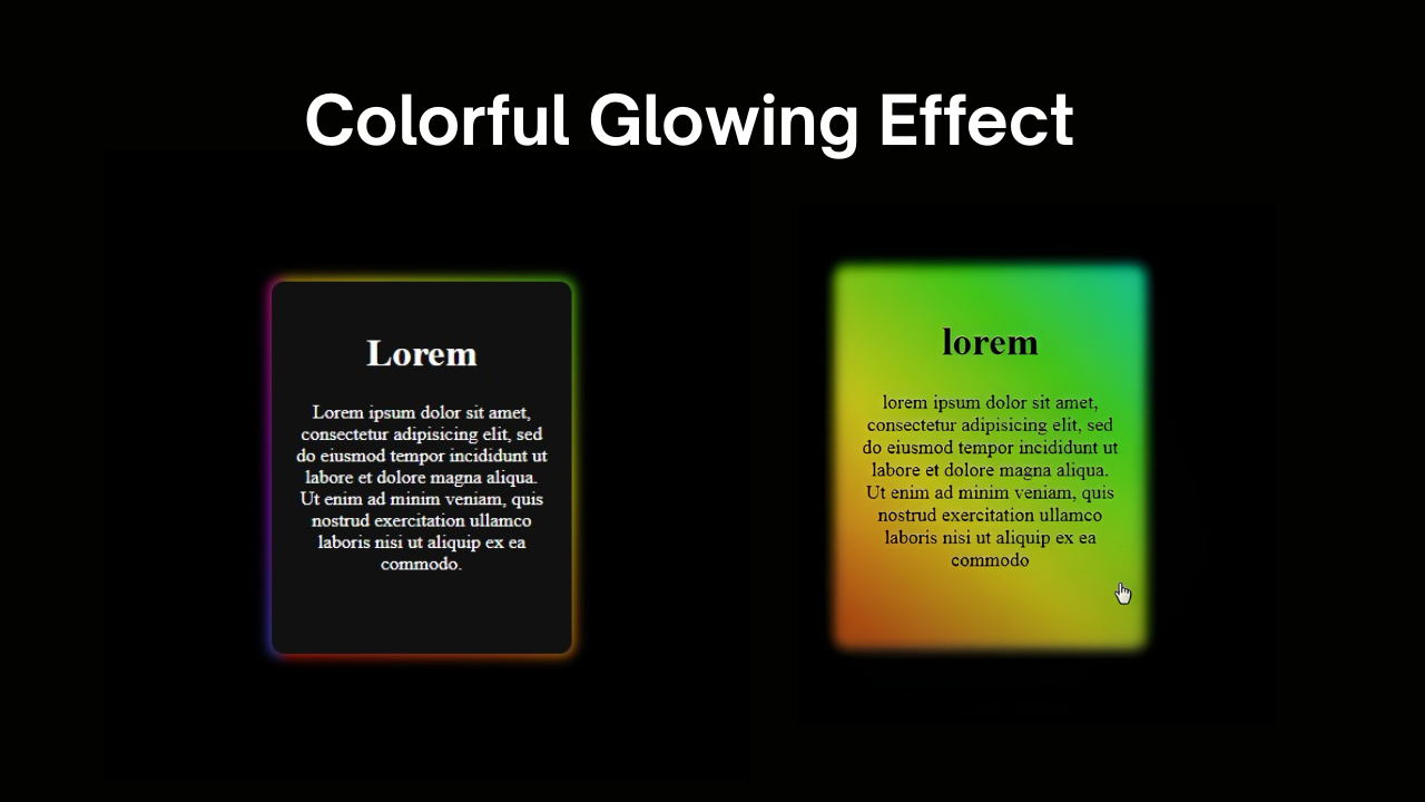
Pure CSS Card Hover Glow Effect with HTML and CSS
Want to make your internet site factors stand out with a stunning glowing hover effect — the use of simply HTML and CSS? In this educational, you’ll learn how to create a glowing card with a subtle neon animation, all without writing a unmarried line of JavaScript.
💡 What You’ll Learn:
- How to use
::beforeand::afterpseudo-elements for layered effects - How CSS gradients, blur, and animation work together for glowing visuals
- Clean, responsive, and AdSense-friendly code structure
📺 Need a Visual Guide?
Watch the step-by-step video tutorial below to fully understand how to create this stunning CSS hover glow card effect from scratch.
📄 HTML Structure:
We’ll start with a simple card using a <div> and some basic content:
<div class="text">
  <h1>Lorem</h1>
  <p>Lorem ipsum dolor sit amet, consectetur adipiscing elit.</p>
</div>
🧠 Why This Structure?
- The
<div class="text">acts as the card container. - The
h1andptags provide content to display inside the card. - This allows CSS to control appearance and hover effects cleanly.
🎨 Key CSS Concepts
.text:before {
  content: '';
  background: linear-gradient(45deg, ...);
  filter: blur(5px);
  animation: glowing 20s linear infinite;
}
✅ Why This Works:
::beforeis used to create a glowing border around the card.linear-gradientgives the color variety.blur()adds softness to the glow.animation+@keyframesmakes it move and shimmer dynamically.