Neumorphism Hover Glow Icons | HTML & CSS Only | Smooth UI Effects
Neumorphism Hover Glow Icons | HTML & CSS Only | Smooth UI Effects
Neumorphism Hover Glow Icons | HTML & CSS Only | Smooth UI Effects

Overview
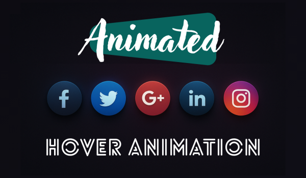
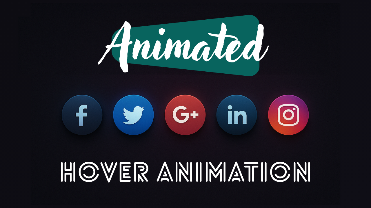
In this tutorial, we will be constructing modern glowing social media icons using HTML, CSS, and Font Awesome. Each icon features a gorgeous gradient background, soft shadows, and a color glow on hover that corresponds to the brand color (such as Facebook blue, Instagram pink, etc.).
This UI is ideal for:
- Website footers
- Profile sections
- Landing pages
- Portfolio websites
Let’s dive in! 🚀
📌 Step 1 — HTML Setup
We create a simple list of social icons, each inside a <ul>.
HTML:
<ul>
<li><a href=”#”><i class=”fa-brands fa-facebook”></i></a> </li>
<li><a href=”#”><i class=”fa-brands fa-twitter”></i></a></li>
…
</ul>
Each icon is placed within a round container that we will style using gradients and shadows.
🎨 Step 2 — CSS Variable (Theme & Colors)
We define a clean color theme using :root, which contains brand colors for each icon.
CSS:
:root {
–dark-bg: #1a1a1a;
–facebook-color: #3b5998;
–twitter-color: #00aced;
…
}
This all works well because the variables make it easy to swap colors out, and their use is of great value in ensuring color consistency.
🖼️ Step 3 — Centering the Icon Layout
We will move all of the icons into the center using absolute positioning along with CSS transforms.
CSS:
ul {
position: absolute;
top: 50%;
left: 50%;
transform: translate(-50%, -50%);
display: flex;
}
This enables a perfectly centered layout on any screen.
💠 Step 4 — Styling The Icon Container
Each icon container will be:
- A circle dimensions of 60x60px
- With a gradient background
- With a subtle shadow
- With a smooth transition of 0.5s
CSS
ul li a {
width: 60px; height: 60px;
border-radius: 50%;
background: linear-gradient(…);
box-shadow: 0 10px 15px rgba(0,0,0,0.5);
transition: 0.5s;
}
🌈 Step 5 — Icon Styles and Hover Glow Effect
The Font Awesome icon within will change colors and glow when hovering over it.
CSS
ul li:nth-child(1) a:hover .fa-brands {
color: var(–facebook-color);
box-shadow: 0 0 20px var(–facebook-color);
}
There are 5 different hover styles for each of the 5 platforms:
This will result in a smooth glow ring in the brand color.
✨ Final Output - What You Built
✔ Stylish gradient icon buttons
✔ Centrally aligned
✔ Matching glow effects per the brand colorway
✔ Modern, minimal, and elegant design
✔ Fully responsive
Design Synth
Welcome to Design Synth! Enter the world of web design, where art meets code. Find awesome designs, practice new techniques, and churn out stunning digital experiences that excite and engage an audience.
Popular Posts

Explore Topics

- Card Design (4)
- Carousel (2)
- CSS and HTML (10)
- Design Synth (11)
- Form Designs (1)
- GSAP (4)
- Header Design (8)
- Hover Effect (4)
- JavaScript (9)
- Navbar Designs (4)
- Parallax (1)
- Slider Designs (2)
- Template Designs (3)
- WordPress (1)
Tag Clouds

- Animation Effects
- Animation Image
- Animation Text
- AOS Animation
- Button
- Card Design
- Cards Design
- Carousel
- Code Tutorials
- Creative Web Templates
- CSS and HTML
- Design Synth
- Effect Image
- Effect Scroll
- Form Design
- Form Designs
- Free Website Template
- Front-End Design
- Glassmorphism Design
- GSAP Animation
- Halloween
- Header Design
- Hover Effects
- HTML
- HTML CSS Projects
- JavaScript
- JS
- Modern Website Design
- Navbar Design
- Navbar Designs
- Parallax Effect
- Parallax Scroll CSS
- Plane Website
- Responsive
- Responsive Design
- Slider Design
- Slider Designs
- SVG
- Tailwind CSS
- Template Designs
- UI Design
- UX Design
- Web Design
- Web Development
- Website Templates
- WordPress Website

Overview
In this tutorial, we will be constructing modern glowing social media icons using HTML, CSS, and Font Awesome. Each icon features a gorgeous gradient background, soft shadows, and a color glow on hover that corresponds to the brand color (such as Facebook blue, Instagram pink, etc.).
This UI is ideal for:
- Website footers
- Profile sections
- Landing pages
- Portfolio websites
Let’s dive in! 🚀
📌 Step 1 — HTML Setup
We create a simple list of social icons, each inside a <ul>.
HTML:
<ul>
<li><a href=”#”><i class=”fa-brands fa-facebook”></i></a> </li>
<li><a href=”#”><i class=”fa-brands fa-twitter”></i></a></li>
…
</ul>
Each icon is placed within a round container that we will style using gradients and shadows.
🎨 Step 2 — CSS Variable (Theme & Colors)
We define a clean color theme using :root, which contains brand colors for each icon.
CSS:
:root {
–dark-bg: #1a1a1a;
–facebook-color: #3b5998;
–twitter-color: #00aced;
…
}
This all works well because the variables make it easy to swap colors out, and their use is of great value in ensuring color consistency.
🖼️ Step 3 — Centering the Icon Layout
We will move all of the icons into the center using absolute positioning along with CSS transforms.
CSS:
ul {
position: absolute;
top: 50%;
left: 50%;
transform: translate(-50%, -50%);
display: flex;
}
This enables a perfectly centered layout on any screen.
💠 Step 4 — Styling The Icon Container
Each icon container will be:
- A circle dimensions of 60x60px
- With a gradient background
- With a subtle shadow
- With a smooth transition of 0.5s
CSS
ul li a {
width: 60px; height: 60px;
border-radius: 50%;
background: linear-gradient(…);
box-shadow: 0 10px 15px rgba(0,0,0,0.5);
transition: 0.5s;
}
🌈 Step 5 — Icon Styles and Hover Glow Effect
The Font Awesome icon within will change colors and glow when hovering over it.
CSS
ul li:nth-child(1) a:hover .fa-brands {
color: var(–facebook-color);
box-shadow: 0 0 20px var(–facebook-color);
}
There are 5 different hover styles for each of the 5 platforms:
This will result in a smooth glow ring in the brand color.
✨ Final Output - What You Built
✔ Stylish gradient icon buttons
✔ Centrally aligned
✔ Matching glow effects per the brand colorway
✔ Modern, minimal, and elegant design
✔ Fully responsive
Design Synth
Welcome to Design Synth! Enter the world of web design, where art meets code. Find awesome designs, practice new techniques, and churn out stunning digital experiences that excite and engage an audience.
Popular Posts

Explore Topics

- Card Design (4)
- Carousel (2)
- CSS and HTML (10)
- Design Synth (11)
- Form Designs (1)
- GSAP (4)
- Header Design (8)
- Hover Effect (4)
- JavaScript (9)
- Navbar Designs (4)
- Parallax (1)
- Slider Designs (2)
- Template Designs (3)
- WordPress (1)
Tag Clouds

- Animation Effects
- Animation Image
- Animation Text
- AOS Animation
- Button
- Card Design
- Cards Design
- Carousel
- Code Tutorials
- Creative Web Templates
- CSS and HTML
- Design Synth
- Effect Image
- Effect Scroll
- Form Design
- Form Designs
- Free Website Template
- Front-End Design
- Glassmorphism Design
- GSAP Animation
- Halloween
- Header Design
- Hover Effects
- HTML
- HTML CSS Projects
- JavaScript
- JS
- Modern Website Design
- Navbar Design
- Navbar Designs
- Parallax Effect
- Parallax Scroll CSS
- Plane Website
- Responsive
- Responsive Design
- Slider Design
- Slider Designs
- SVG
- Tailwind CSS
- Template Designs
- UI Design
- UX Design
- Web Design
- Web Development
- Website Templates
- WordPress Website

Overview
In this tutorial, we will be constructing modern glowing social media icons using HTML, CSS, and Font Awesome. Each icon features a gorgeous gradient background, soft shadows, and a color glow on hover that corresponds to the brand color (such as Facebook blue, Instagram pink, etc.).
This UI is ideal for:
- Website footers
- Profile sections
- Landing pages
- Portfolio websites
Let’s dive in! 🚀
📌 Step 1 — HTML Setup
We create a simple list of social icons, each inside a <ul>.
HTML:
<ul>
<li><a href=”#”><i class=”fa-brands fa-facebook”></i></a> </li>
<li><a href=”#”><i class=”fa-brands fa-twitter”></i></a></li>
…
</ul>
Each icon is placed within a round container that we will style using gradients and shadows.
🎨 Step 2 — CSS Variable (Theme & Colors)
We define a clean color theme using :root, which contains brand colors for each icon.
CSS:
:root {
–dark-bg: #1a1a1a;
–facebook-color: #3b5998;
–twitter-color: #00aced;
…
}
This all works well because the variables make it easy to swap colors out, and their use is of great value in ensuring color consistency.
🖼️ Step 3 — Centering the Icon Layout
We will move all of the icons into the center using absolute positioning along with CSS transforms.
CSS:
ul {
position: absolute;
top: 50%;
left: 50%;
transform: translate(-50%, -50%);
display: flex;
}
This enables a perfectly centered layout on any screen.
💠 Step 4 — Styling The Icon Container
Each icon container will be:
- A circle dimensions of 60x60px
- With a gradient background
- With a subtle shadow
- With a smooth transition of 0.5s
CSS
ul li a {
width: 60px; height: 60px;
border-radius: 50%;
background: linear-gradient(…);
box-shadow: 0 10px 15px rgba(0,0,0,0.5);
transition: 0.5s;
}
🌈 Step 5 — Icon Styles and Hover Glow Effect
The Font Awesome icon within will change colors and glow when hovering over it.
CSS
ul li:nth-child(1) a:hover .fa-brands {
color: var(–facebook-color);
box-shadow: 0 0 20px var(–facebook-color);
}
There are 5 different hover styles for each of the 5 platforms:
This will result in a smooth glow ring in the brand color.
✨ Final Output - What You Built
✔ Stylish gradient icon buttons
✔ Centrally aligned
✔ Matching glow effects per the brand colorway
✔ Modern, minimal, and elegant design
✔ Fully responsive
Design Synth
Welcome to Design Synth! Enter the world of web design, where art meets code. Find awesome designs, practice new techniques, and churn out stunning digital experiences that excite and engage an audience.
Popular Posts

Explore Topics

- Card Design (4)
- Carousel (2)
- CSS and HTML (10)
- Design Synth (11)
- Form Designs (1)
- GSAP (4)
- Header Design (8)
- Hover Effect (4)
- JavaScript (9)
- Navbar Designs (4)
- Parallax (1)
- Slider Designs (2)
- Template Designs (3)
- WordPress (1)
Tag Clouds

- Animation Effects
- Animation Image
- Animation Text
- AOS Animation
- Button
- Card Design
- Cards Design
- Carousel
- Code Tutorials
- Creative Web Templates
- CSS and HTML
- Design Synth
- Effect Image
- Effect Scroll
- Form Design
- Form Designs
- Free Website Template
- Front-End Design
- Glassmorphism Design
- GSAP Animation
- Halloween
- Header Design
- Hover Effects
- HTML
- HTML CSS Projects
- JavaScript
- JS
- Modern Website Design
- Navbar Design
- Navbar Designs
- Parallax Effect
- Parallax Scroll CSS
- Plane Website
- Responsive
- Responsive Design
- Slider Design
- Slider Designs
- SVG
- Tailwind CSS
- Template Designs
- UI Design
- UX Design
- Web Design
- Web Development
- Website Templates
- WordPress Website


