Motorbike Website Using HTML CSS & JavaScript
Motorbike Website Using HTML CSS & JavaScript
Motorbike Website Using HTML CSS & JavaScript

Overview
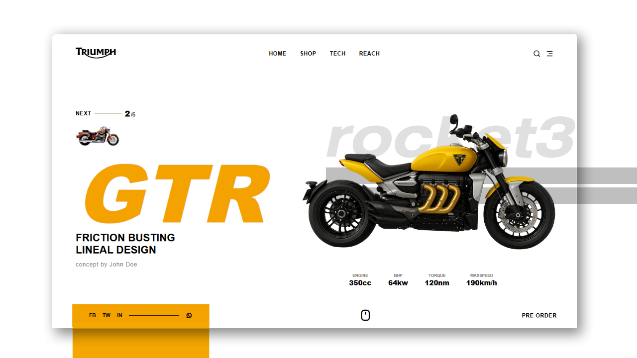
Welcome to the boldly interactive motorbike showcase page for the GTR Series.
The design utilizes simple color palettes, a bold typeface selection, and a responsive interactive design to convey power, precision, and modern luxury.
The page includes:
- A responsive navigational bar with a mobile menu toggle
- A hero section that allows an interesting way to display typography and performance specifications
- A footer with social media and a preorder link
- Smooth transitions and layout shifting for mobile
Project Structure
Before we begin, create the following file structure:
motorbike-GTR-showcase/
│
├── index.html
├── style.css
├── script.js
└── images/
├── bike.png
├── next-bike.png
└── logo.svg
🧱 Step 1: Header & Navigation
HTML:
<header class=”header”>
<div class=”logo”>
<img src=”images/logo.svg” alt=”Logo”>
</div>
<nav class=”nav-links”>
<a href=”#”>HOME</a>
<a href=”#”>SHOP</a>
…
</nav>
<div class=”nav-icons”>
<i class=”ri-search-line”></i>
…
</div>
</header>
Main Features
- Flexbox arrangement for measured alignment
- Icon set from Remix Icons for clean UI icons
- Responsive behaviour: hides menu links, small screens display a hamburger icon
🧱 Step 2: Mobile Menu
HTML
<div class=”mobile-menu” id=”mobileMenu”>
<i class=”ri-close-line close-icon” id=”closeIcon”></i>
<div class=”mobile-nav-links”>
<a href=”#”>HOME</a>
<a href=”#”>SHOP</a>
…
</div>
<div class=”mobile-nav-icons”>
<a href=”#”><i class=”ri-facebook-line”></i><span>Facebook</span></a>
…
</div>
</div>
Highlights
- Opens/Closes with a smooth fade animation
- Icons are shown horizontally for a modern touch
- Close button (X) on the top-right corner disappears
🧱 Step 3: Hero Section
HTML
<main class=”hero”>
<div class=”left”>
<div class=”next-thumb”>
<div class=”next-top”>
<span class=”next-label”>NEXT</span>
…
</div>
…
</div>
<h2 class=”model”>GTR</h2>
<h3 class=”tagline”>FRICTION BUSTING<br>LINEAL DESIGN</h3>
…
</div>
<div class=”right”>
<h1 class=”bg-title”>ROCKET3</h1>
<img src=”images/bike.png” alt=”Motorbike” class=”bike”>
<div class=”specs”>
<div class=”spec”><small>ENGINE</small><strong>350CC</strong> </div>
…
</div>
</div>
</main>
Main Features
- Split screen layout: text on the left, image on the right
- Big model typography (GTR) draws on the power of the title
- Dimmed background title (ROCKET3) for depth
- Specs are displayed in a clean grid for performance
🧱 Step 4: Footer Section
HTML
<footer class=”footer”>
<div class=”footer-left”>
<div class=”social-box”>
<a href=”#”>FB</a>
…
</div>
</div>
<div class=”footer-center”>
<div class=”mouse-icon”>…</div>
</div>
<div class=”footer-right”>
<a href=”#” class=”preorder”>PRE ORDER</a>
</div>
</footer>
Highlights
- Social bar in yellow-orange on the left side of the footer sections
- Animated mouse scroll indicator at the center
- Preorder CTA button on the right side of the footer
🧱 Step5: JavaScript Functionality
JS
// Mobile Menu Toggle…
const menuIcon = document.getElementById(‘menuIcon’);
const closeIcon = document.getElementById(‘closeIcon’);
const mobileMenu = document.getElementById(‘mobileMenu’);
menuIcon.addEventListener(‘click’, () => { … });
closeIcon.addEventListener(‘click’, () => { … });
// Mouse wheel animation…
…
Features
- Smoothly nudging menu open/closed
- Continuing the mouse wheel motion nudges smooth movement to provide subtle movement to UI
🧱 Step6: CSS Highlights
Techniques Used
- :root variables for a consistent theme
- Flexbox for layout
- Absolute positioning for the background titles
- Clip-path and transform for visual depth
- Responsive design using media queries
Example Snippet
.hero {
display: flex;
align-items: center;
justify-content: space-between;
padding: 50px 80px;
position: relative;
}
.model {
font-size: 18rem;
font-style: italic;
color: #f4a200;
font-weight: 800;
}
.bg-title {
font-size: 10rem;
color: rgba(0, 0, 0, 0.05);
position: absolute;
left: 50%;
transform: translateX(-50%);
}
🧱 Step7: Responsive Design
Responsive Changes
- Below 1024px, text/image scales down
- Below 768px, hero area stacks vertically
- Below 480px, logo is compact with less spacing
The goal is to ensure it looks premium and readable at all screen sizes.
🚀 Key Visual Elements
- Dual-Toned Layout – Modern appeal in black, white, and golden-yellow
- Dynamic Typography – Large italicized “GTR“ text layered to give it an energetic feel and be dynamic
- Scroll Cue Animation – Subtle invitation for interaction
- Fluid Navigation – Moves easily across mobile/desktop styles
- Performance Driven Specs Grid – Clean aesthetics and informational
🚀 Key Visual Elements
This Motorbike GTR Showcase configures modern typography, bold imagery, and a minimalist layout design to create a powerful interactive brand experience– perfect for automotive websites or tech-based landing pages.
Previous Post
Design Synth
Welcome to Design Synth! Enter the world of web design, where art meets code. Find awesome designs, practice new techniques, and churn out stunning digital experiences that excite and engage an audience.
Popular Posts

Explore Topics

- Card Design (4)
- Carousel (2)
- CSS and HTML (10)
- Design Synth (11)
- Form Designs (1)
- GSAP (4)
- Header Design (8)
- Hover Effect (4)
- JavaScript (9)
- Navbar Designs (4)
- Parallax (1)
- Slider Designs (2)
- Template Designs (3)
- WordPress (1)
Tag Clouds

- Animation Effects
- Animation Image
- Animation Text
- AOS Animation
- Button
- Card Design
- Cards Design
- Carousel
- Code Tutorials
- Creative Web Templates
- CSS and HTML
- Design Synth
- Effect Image
- Effect Scroll
- Form Design
- Form Designs
- Free Website Template
- Front-End Design
- Glassmorphism Design
- GSAP Animation
- Halloween
- Header Design
- Hover Effects
- HTML
- HTML CSS Projects
- JavaScript
- JS
- Modern Website Design
- Navbar Design
- Navbar Designs
- Parallax Effect
- Parallax Scroll CSS
- Plane Website
- Responsive
- Responsive Design
- Slider Design
- Slider Designs
- SVG
- Tailwind CSS
- Template Designs
- UI Design
- UX Design
- Web Design
- Web Development
- Website Templates
- WordPress Website

Overview
Welcome to the boldly interactive motorbike showcase page for the GTR Series.
The design utilizes simple color palettes, a bold typeface selection, and a responsive interactive design to convey power, precision, and modern luxury.
The page includes:
- A responsive navigational bar with a mobile menu toggle
- A hero section that allows an interesting way to display typography and performance specifications
- A footer with social media and a preorder link
- Smooth transitions and layout shifting for mobile
Project Structure
Before we begin, create the following file structure:
motorbike-GTR-showcase/
│
├── index.html
├── style.css
├── script.js
└── images/
├── bike.png
├── next-bike.png
└── logo.svg
🧱 Step 1: Header & Navigation
HTML:
<header class=”header”>
<div class=”logo”>
<img src=”images/logo.svg” alt=”Logo”>
</div>
<nav class=”nav-links”>
<a href=”#”>HOME</a>
<a href=”#”>SHOP</a>
…
</nav>
<div class=”nav-icons”>
<i class=”ri-search-line”></i>
…
</div>
</header>
Main Features
- Flexbox arrangement for measured alignment
- Icon set from Remix Icons for clean UI icons
- Responsive behaviour: hides menu links, small screens display a hamburger icon
🧱 Step 2: Mobile Menu
HTML
<div class=”mobile-menu” id=”mobileMenu”>
<i class=”ri-close-line close-icon” id=”closeIcon”></i>
<div class=”mobile-nav-links”>
<a href=”#”>HOME</a>
<a href=”#”>SHOP</a>
…
</div>
<div class=”mobile-nav-icons”>
<a href=”#”><i class=”ri-facebook-line”></i><span>Facebook</span></a>
…
</div>
</div>
Highlights
- Opens/Closes with a smooth fade animation
- Icons are shown horizontally for a modern touch
- Close button (X) on the top-right corner disappears
🧱 Step 3: Hero Section
HTML
<main class=”hero”>
<div class=”left”>
<div class=”next-thumb”>
<div class=”next-top”>
<span class=”next-label”>NEXT</span>
…
</div>
…
</div>
<h2 class=”model”>GTR</h2>
<h3 class=”tagline”>FRICTION BUSTING<br>LINEAL DESIGN</h3>
…
</div>
<div class=”right”>
<h1 class=”bg-title”>ROCKET3</h1>
<img src=”images/bike.png” alt=”Motorbike” class=”bike”>
<div class=”specs”>
<div class=”spec”><small>ENGINE</small><strong>350CC</strong> </div>
…
</div>
</div>
</main>
Main Features
- Split screen layout: text on the left, image on the right
- Big model typography (GTR) draws on the power of the title
- Dimmed background title (ROCKET3) for depth
- Specs are displayed in a clean grid for performance
🧱 Step 4: Footer Section
HTML
<footer class=”footer”>
<div class=”footer-left”>
<div class=”social-box”>
<a href=”#”>FB</a>
…
</div>
</div>
<div class=”footer-center”>
<div class=”mouse-icon”>…</div>
</div>
<div class=”footer-right”>
<a href=”#” class=”preorder”>PRE ORDER</a>
</div>
</footer>
Highlights
- Social bar in yellow-orange on the left side of the footer sections
- Animated mouse scroll indicator at the center
- Preorder CTA button on the right side of the footer
🧱 Step5: JavaScript Functionality
JS
// Mobile Menu Toggle…
const menuIcon = document.getElementById(‘menuIcon’);
const closeIcon = document.getElementById(‘closeIcon’);
const mobileMenu = document.getElementById(‘mobileMenu’);
menuIcon.addEventListener(‘click’, () => { … });
closeIcon.addEventListener(‘click’, () => { … });
// Mouse wheel animation…
…
Features
- Smoothly nudging menu open/closed
- Continuing the mouse wheel motion nudges smooth movement to provide subtle movement to UI
🧱 Step6: CSS Highlights
Techniques Used
- :root variables for a consistent theme
- Flexbox for layout
- Absolute positioning for the background titles
- Clip-path and transform for visual depth
- Responsive design using media queries
Example Snippet
.hero {
display: flex;
align-items: center;
justify-content: space-between;
padding: 50px 80px;
position: relative;
}
.model {
font-size: 18rem;
font-style: italic;
color: #f4a200;
font-weight: 800;
}
.bg-title {
font-size: 10rem;
color: rgba(0, 0, 0, 0.05);
position: absolute;
left: 50%;
transform: translateX(-50%);
}
🧱 Step7: Responsive Design
Responsive Changes
- Below 1024px, text/image scales down
- Below 768px, hero area stacks vertically
- Below 480px, logo is compact with less spacing
The goal is to ensure it looks premium and readable at all screen sizes.
🚀 Key Visual Elements
- Dual-Toned Layout – Modern appeal in black, white, and golden-yellow
- Dynamic Typography – Large italicized “GTR“ text layered to give it an energetic feel and be dynamic
- Scroll Cue Animation – Subtle invitation for interaction
- Fluid Navigation – Moves easily across mobile/desktop styles
- Performance Driven Specs Grid – Clean aesthetics and informational
🚀 Key Visual Elements
This Motorbike GTR Showcase configures modern typography, bold imagery, and a minimalist layout design to create a powerful interactive brand experience– perfect for automotive websites or tech-based landing pages.
Previous Post
Design Synth
Welcome to Design Synth! Enter the world of web design, where art meets code. Find awesome designs, practice new techniques, and churn out stunning digital experiences that excite and engage an audience.
Popular Posts

Explore Topics

- Card Design (4)
- Carousel (2)
- CSS and HTML (10)
- Design Synth (11)
- Form Designs (1)
- GSAP (4)
- Header Design (8)
- Hover Effect (4)
- JavaScript (9)
- Navbar Designs (4)
- Parallax (1)
- Slider Designs (2)
- Template Designs (3)
- WordPress (1)
Tag Clouds

- Animation Effects
- Animation Image
- Animation Text
- AOS Animation
- Button
- Card Design
- Cards Design
- Carousel
- Code Tutorials
- Creative Web Templates
- CSS and HTML
- Design Synth
- Effect Image
- Effect Scroll
- Form Design
- Form Designs
- Free Website Template
- Front-End Design
- Glassmorphism Design
- GSAP Animation
- Halloween
- Header Design
- Hover Effects
- HTML
- HTML CSS Projects
- JavaScript
- JS
- Modern Website Design
- Navbar Design
- Navbar Designs
- Parallax Effect
- Parallax Scroll CSS
- Plane Website
- Responsive
- Responsive Design
- Slider Design
- Slider Designs
- SVG
- Tailwind CSS
- Template Designs
- UI Design
- UX Design
- Web Design
- Web Development
- Website Templates
- WordPress Website

Overview
Welcome to the boldly interactive motorbike showcase page for the GTR Series.
The design utilizes simple color palettes, a bold typeface selection, and a responsive interactive design to convey power, precision, and modern luxury.
The page includes:
- A responsive navigational bar with a mobile menu toggle
- A hero section that allows an interesting way to display typography and performance specifications
- A footer with social media and a preorder link
- Smooth transitions and layout shifting for mobile
Project Structure
Before we begin, create the following file structure:
motorbike-GTR-showcase/
│
├── index.html
├── style.css
├── script.js
└── images/
├── bike.png
├── next-bike.png
└── logo.svg
🧱 Step 1: Header & Navigation
HTML:
<header class=”header”>
<div class=”logo”>
<img src=”images/logo.svg” alt=”Logo”>
</div>
<nav class=”nav-links”>
<a href=”#”>HOME</a>
<a href=”#”>SHOP</a>
…
</nav>
<div class=”nav-icons”>
<i class=”ri-search-line”></i>
…
</div>
</header>
Main Features
- Flexbox arrangement for measured alignment
- Icon set from Remix Icons for clean UI icons
- Responsive behaviour: hides menu links, small screens display a hamburger icon
🧱 Step 2: Mobile Menu
HTML
<div class=”mobile-menu” id=”mobileMenu”>
<i class=”ri-close-line close-icon” id=”closeIcon”></i>
<div class=”mobile-nav-links”>
<a href=”#”>HOME</a>
<a href=”#”>SHOP</a>
…
</div>
<div class=”mobile-nav-icons”>
<a href=”#”><i class=”ri-facebook-line”></i><span>Facebook</span></a>
…
</div>
</div>
Highlights
- Opens/Closes with a smooth fade animation
- Icons are shown horizontally for a modern touch
- Close button (X) on the top-right corner disappears
🧱 Step 3: Hero Section
HTML
<main class=”hero”>
<div class=”left”>
<div class=”next-thumb”>
<div class=”next-top”>
<span class=”next-label”>NEXT</span>
…
</div>
…
</div>
<h2 class=”model”>GTR</h2>
<h3 class=”tagline”>FRICTION BUSTING<br>LINEAL DESIGN</h3>
…
</div>
<div class=”right”>
<h1 class=”bg-title”>ROCKET3</h1>
<img src=”images/bike.png” alt=”Motorbike” class=”bike”>
<div class=”specs”>
<div class=”spec”><small>ENGINE</small><strong>350CC</strong> </div>
…
</div>
</div>
</main>
Main Features
- Split screen layout: text on the left, image on the right
- Big model typography (GTR) draws on the power of the title
- Dimmed background title (ROCKET3) for depth
- Specs are displayed in a clean grid for performance
🧱 Step 4: Footer Section
HTML
<footer class=”footer”>
<div class=”footer-left”>
<div class=”social-box”>
<a href=”#”>FB</a>
…
</div>
</div>
<div class=”footer-center”>
<div class=”mouse-icon”>…</div>
</div>
<div class=”footer-right”>
<a href=”#” class=”preorder”>PRE ORDER</a>
</div>
</footer>
Highlights
- Social bar in yellow-orange on the left side of the footer sections
- Animated mouse scroll indicator at the center
- Preorder CTA button on the right side of the footer
🧱 Step5: JavaScript Functionality
JS
// Mobile Menu Toggle…
const menuIcon = document.getElementById(‘menuIcon’);
const closeIcon = document.getElementById(‘closeIcon’);
const mobileMenu = document.getElementById(‘mobileMenu’);
menuIcon.addEventListener(‘click’, () => { … });
closeIcon.addEventListener(‘click’, () => { … });
// Mouse wheel animation…
…
Features
- Smoothly nudging menu open/closed
- Continuing the mouse wheel motion nudges smooth movement to provide subtle movement to UI
🧱 Step6: CSS Highlights
Techniques Used
- :root variables for a consistent theme
- Flexbox for layout
- Absolute positioning for the background titles
- Clip-path and transform for visual depth
- Responsive design using media queries
Example Snippet
.hero {
display: flex;
align-items: center;
justify-content: space-between;
padding: 50px 80px;
position: relative;
}
.model {
font-size: 18rem;
font-style: italic;
color: #f4a200;
font-weight: 800;
}
.bg-title {
font-size: 10rem;
color: rgba(0, 0, 0, 0.05);
position: absolute;
left: 50%;
transform: translateX(-50%);
}
🧱 Step7: Responsive Design
Responsive Changes
- Below 1024px, text/image scales down
- Below 768px, hero area stacks vertically
- Below 480px, logo is compact with less spacing
The goal is to ensure it looks premium and readable at all screen sizes.
🚀 Key Visual Elements
- Dual-Toned Layout – Modern appeal in black, white, and golden-yellow
- Dynamic Typography – Large italicized “GTR“ text layered to give it an energetic feel and be dynamic
- Scroll Cue Animation – Subtle invitation for interaction
- Fluid Navigation – Moves easily across mobile/desktop styles
- Performance Driven Specs Grid – Clean aesthetics and informational
🚀 Key Visual Elements
This Motorbike GTR Showcase configures modern typography, bold imagery, and a minimalist layout design to create a powerful interactive brand experience– perfect for automotive websites or tech-based landing pages.
Previous Post
Design Synth
Welcome to Design Synth! Enter the world of web design, where art meets code. Find awesome designs, practice new techniques, and churn out stunning digital experiences that excite and engage an audience.
Popular Posts

Explore Topics

- Card Design (4)
- Carousel (2)
- CSS and HTML (10)
- Design Synth (11)
- Form Designs (1)
- GSAP (4)
- Header Design (8)
- Hover Effect (4)
- JavaScript (9)
- Navbar Designs (4)
- Parallax (1)
- Slider Designs (2)
- Template Designs (3)
- WordPress (1)
Tag Clouds

- Animation Effects
- Animation Image
- Animation Text
- AOS Animation
- Button
- Card Design
- Cards Design
- Carousel
- Code Tutorials
- Creative Web Templates
- CSS and HTML
- Design Synth
- Effect Image
- Effect Scroll
- Form Design
- Form Designs
- Free Website Template
- Front-End Design
- Glassmorphism Design
- GSAP Animation
- Halloween
- Header Design
- Hover Effects
- HTML
- HTML CSS Projects
- JavaScript
- JS
- Modern Website Design
- Navbar Design
- Navbar Designs
- Parallax Effect
- Parallax Scroll CSS
- Plane Website
- Responsive
- Responsive Design
- Slider Design
- Slider Designs
- SVG
- Tailwind CSS
- Template Designs
- UI Design
- UX Design
- Web Design
- Web Development
- Website Templates
- WordPress Website


