Create an Animated Services Section Using HTML & CSS
Create an Animated Services Section Using HTML & CSS
Create an Animated Services Section Using HTML & CSS

Overview
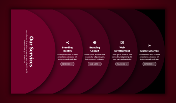
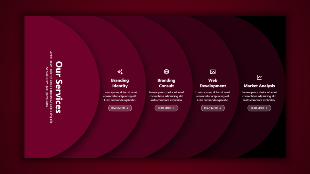
In this project, we are designing a premium “Our Services” section that incorporates layered circular backgrounds, a smooth slide-in animation, minimal typography, and gorgeous Remix Icons for an eye-catching visual. This section is suitable for digital agencies, portfolio sites, modern landing pages, and creative sites.
The effect is styled using 5 giant circles set to slide in from the left at staggered intervals to create a stunning effect of depth.
🔹 Step 1 — Base Setup & Background
We’ll start with the global resets, and a clean black background.
CSS:
* { margin: 0; padding: 0; box-sizing: border-box; }
body { background: #000; color: #fff; font-family: ‘Segoe UI’, sans-serif; }
…
This will create a clean, minimal modern canvas for the animation.
🔹 Step 2 — Main Section Layout
The entire services module is centered using flexbox and set with spacing for the large circular shapes.
HTML:
<section class=”services-section”>
<div class=”circle circle-1″>…</div>
<div class=”circle circle-2″>…</div>
…
</section>
CSS:
.services-section {
height: 100vh;
display: flex;
justify-content: center;
align-items: center;
gap: 30px;
}
🔹 Step 3 — Creating the Layered Circles
Each circle has:
✔ Different background shade
✔ Absolute positioning
✔ Large size (810×810)
✔ Slide-in animation
✔ Increasing negative z-index for depth
CSS:
.circle {
width: 810px; height: 810px;
border-radius: 50%;
position: absolute;
animation: slideIn 1s ease-out forwards;
opacity: 0;
}
Each circle is set to use its own delay.
CSS:
.circle-1 { background: #70012b; animation-delay: 0s; }
.circle-2 { background: #5d0124; animation-delay: 0.1s; }
…
All of the sliding is accomplished with:
CSS:
@keyframes slideIn {
0% { transform: translateX(-800px); opacity: 0; }
100% { transform: translateX(0); opacity: 1; }
}
🔹 Step 4 — Main Left Vertical Heading
The first circle holds the main content text, on an angle for a fun modern touch.
HTML:
<div class=”service-text”>
<h2>Our Services</h2>
<p>…</p>
</div>
CSS:
.service-text {
writing-mode: vertical-rl;
transform: rotate(180deg);
right: 50px;
}
The typography maintains its strong visual while remaining readable and simple.
🔹 Step 5 — Service Cards Inside Each Circle
Each of the circles holds a different service card:
✔ Icon
✔ Title
✔ Short description
✔ “Read More” button
HTML:
<div class=”service-card”>
<span class=”icon”><i class=”ri-image-line”></i></span>
<h3>Web Development</h3>
<p>…</p>
<a href=”#” class=”btn”>READ MORE <i class=”ri-arrow-right-line”></i></a>
</div>
Icons are using Remix Icon, for a clean visual touch.
🔹 Step 6 — Button & Interaction Style
The button is a subtle transparency with a border as a glowing button.
CSS:
.btn {
padding: 8px 16px;
border-radius: 20px;
background: rgba(255,255,255,0.2);
border: 1px solid #fff;
}
This maintains a current, minimal, agency-styled design.
🎯 Final Result (Created)
✔ Layered sliding circles with depth animation
✔ A creative turning vertical “Our Service” section
✔ Clean and symmetrical service cards
✔ Smooth staggered entry animations
✔ Fully centered gallery-like layout
✔ Great for SaaS, agency, and portfolios.
Design Synth
Welcome to Design Synth! Enter the world of web design, where art meets code. Find awesome designs, practice new techniques, and churn out stunning digital experiences that excite and engage an audience.
Popular Posts

Explore Topics

- Card Design (4)
- Carousel (2)
- CSS and HTML (10)
- Design Synth (11)
- Form Designs (1)
- GSAP (4)
- Header Design (8)
- Hover Effect (4)
- JavaScript (9)
- Navbar Designs (4)
- Parallax (1)
- Slider Designs (2)
- Template Designs (3)
- WordPress (1)
Tag Clouds

- Animation Effects
- Animation Image
- Animation Text
- AOS Animation
- Button
- Card Design
- Cards Design
- Carousel
- Code Tutorials
- Creative Web Templates
- CSS and HTML
- Design Synth
- Effect Image
- Effect Scroll
- Form Design
- Form Designs
- Free Website Template
- Front-End Design
- Glassmorphism Design
- GSAP Animation
- Halloween
- Header Design
- Hover Effects
- HTML
- HTML CSS Projects
- JavaScript
- JS
- Modern Website Design
- Navbar Design
- Navbar Designs
- Parallax Effect
- Parallax Scroll CSS
- Plane Website
- Responsive
- Responsive Design
- Slider Design
- Slider Designs
- SVG
- Tailwind CSS
- Template Designs
- UI Design
- UX Design
- Web Design
- Web Development
- Website Templates
- WordPress Website

Overview
In this project, we are designing a premium “Our Services” section that incorporates layered circular backgrounds, a smooth slide-in animation, minimal typography, and gorgeous Remix Icons for an eye-catching visual. This section is suitable for digital agencies, portfolio sites, modern landing pages, and creative sites.
The effect is styled using 5 giant circles set to slide in from the left at staggered intervals to create a stunning effect of depth.
🔹 Step 1 — Base Setup & Background
We’ll start with the global resets, and a clean black background.
CSS:
* { margin: 0; padding: 0; box-sizing: border-box; }
body { background: #000; color: #fff; font-family: ‘Segoe UI’, sans-serif; }
…
This will create a clean, minimal modern canvas for the animation.
🔹 Step 2 — Main Section Layout
The entire services module is centered using flexbox and set with spacing for the large circular shapes.
HTML:
<section class=”services-section”>
<div class=”circle circle-1″>…</div>
<div class=”circle circle-2″>…</div>
…
</section>
CSS:
.services-section {
height: 100vh;
display: flex;
justify-content: center;
align-items: center;
gap: 30px;
}
🔹 Step 3 — Creating the Layered Circles
Each circle has:
✔ Different background shade
✔ Absolute positioning
✔ Large size (810×810)
✔ Slide-in animation
✔ Increasing negative z-index for depth
CSS:
.circle {
width: 810px; height: 810px;
border-radius: 50%;
position: absolute;
animation: slideIn 1s ease-out forwards;
opacity: 0;
}
Each circle is set to use its own delay.
CSS:
.circle-1 { background: #70012b; animation-delay: 0s; }
.circle-2 { background: #5d0124; animation-delay: 0.1s; }
…
All of the sliding is accomplished with:
CSS:
@keyframes slideIn {
0% { transform: translateX(-800px); opacity: 0; }
100% { transform: translateX(0); opacity: 1; }
}
🔹 Step 4 — Main Left Vertical Heading
The first circle holds the main content text, on an angle for a fun modern touch.
HTML:
<div class=”service-text”>
<h2>Our Services</h2>
<p>…</p>
</div>
CSS:
.service-text {
writing-mode: vertical-rl;
transform: rotate(180deg);
right: 50px;
}
The typography maintains its strong visual while remaining readable and simple.
🔹 Step 5 — Service Cards Inside Each Circle
Each of the circles holds a different service card:
✔ Icon
✔ Title
✔ Short description
✔ “Read More” button
HTML:
<div class=”service-card”>
<span class=”icon”><i class=”ri-image-line”></i></span>
<h3>Web Development</h3>
<p>…</p>
<a href=”#” class=”btn”>READ MORE <i class=”ri-arrow-right-line”></i></a>
</div>
Icons are using Remix Icon, for a clean visual touch.
🔹 Step 6 — Button & Interaction Style
The button is a subtle transparency with a border as a glowing button.
CSS:
.btn {
padding: 8px 16px;
border-radius: 20px;
background: rgba(255,255,255,0.2);
border: 1px solid #fff;
}
This maintains a current, minimal, agency-styled design.
🎯 Final Result (Created)
✔ Layered sliding circles with depth animation
✔ A creative turning vertical “Our Service” section
✔ Clean and symmetrical service cards
✔ Smooth staggered entry animations
✔ Fully centered gallery-like layout
✔ Great for SaaS, agency, and portfolios.
Design Synth
Welcome to Design Synth! Enter the world of web design, where art meets code. Find awesome designs, practice new techniques, and churn out stunning digital experiences that excite and engage an audience.
Popular Posts

Explore Topics

- Card Design (4)
- Carousel (2)
- CSS and HTML (10)
- Design Synth (11)
- Form Designs (1)
- GSAP (4)
- Header Design (8)
- Hover Effect (4)
- JavaScript (9)
- Navbar Designs (4)
- Parallax (1)
- Slider Designs (2)
- Template Designs (3)
- WordPress (1)
Tag Clouds

- Animation Effects
- Animation Image
- Animation Text
- AOS Animation
- Button
- Card Design
- Cards Design
- Carousel
- Code Tutorials
- Creative Web Templates
- CSS and HTML
- Design Synth
- Effect Image
- Effect Scroll
- Form Design
- Form Designs
- Free Website Template
- Front-End Design
- Glassmorphism Design
- GSAP Animation
- Halloween
- Header Design
- Hover Effects
- HTML
- HTML CSS Projects
- JavaScript
- JS
- Modern Website Design
- Navbar Design
- Navbar Designs
- Parallax Effect
- Parallax Scroll CSS
- Plane Website
- Responsive
- Responsive Design
- Slider Design
- Slider Designs
- SVG
- Tailwind CSS
- Template Designs
- UI Design
- UX Design
- Web Design
- Web Development
- Website Templates
- WordPress Website

Overview
In this project, we are designing a premium “Our Services” section that incorporates layered circular backgrounds, a smooth slide-in animation, minimal typography, and gorgeous Remix Icons for an eye-catching visual. This section is suitable for digital agencies, portfolio sites, modern landing pages, and creative sites.
The effect is styled using 5 giant circles set to slide in from the left at staggered intervals to create a stunning effect of depth.
🔹 Step 1 — Base Setup & Background
We’ll start with the global resets, and a clean black background.
CSS:
* { margin: 0; padding: 0; box-sizing: border-box; }
body { background: #000; color: #fff; font-family: ‘Segoe UI’, sans-serif; }
…
This will create a clean, minimal modern canvas for the animation.
🔹 Step 2 — Main Section Layout
The entire services module is centered using flexbox and set with spacing for the large circular shapes.
HTML:
<section class=”services-section”>
<div class=”circle circle-1″>…</div>
<div class=”circle circle-2″>…</div>
…
</section>
CSS:
.services-section {
height: 100vh;
display: flex;
justify-content: center;
align-items: center;
gap: 30px;
}
🔹 Step 3 — Creating the Layered Circles
Each circle has:
✔ Different background shade
✔ Absolute positioning
✔ Large size (810×810)
✔ Slide-in animation
✔ Increasing negative z-index for depth
CSS:
.circle {
width: 810px; height: 810px;
border-radius: 50%;
position: absolute;
animation: slideIn 1s ease-out forwards;
opacity: 0;
}
Each circle is set to use its own delay.
CSS:
.circle-1 { background: #70012b; animation-delay: 0s; }
.circle-2 { background: #5d0124; animation-delay: 0.1s; }
…
All of the sliding is accomplished with:
CSS:
@keyframes slideIn {
0% { transform: translateX(-800px); opacity: 0; }
100% { transform: translateX(0); opacity: 1; }
}
🔹 Step 4 — Main Left Vertical Heading
The first circle holds the main content text, on an angle for a fun modern touch.
HTML:
<div class=”service-text”>
<h2>Our Services</h2>
<p>…</p>
</div>
CSS:
.service-text {
writing-mode: vertical-rl;
transform: rotate(180deg);
right: 50px;
}
The typography maintains its strong visual while remaining readable and simple.
🔹 Step 5 — Service Cards Inside Each Circle
Each of the circles holds a different service card:
✔ Icon
✔ Title
✔ Short description
✔ “Read More” button
HTML:
<div class=”service-card”>
<span class=”icon”><i class=”ri-image-line”></i></span>
<h3>Web Development</h3>
<p>…</p>
<a href=”#” class=”btn”>READ MORE <i class=”ri-arrow-right-line”></i></a>
</div>
Icons are using Remix Icon, for a clean visual touch.
🔹 Step 6 — Button & Interaction Style
The button is a subtle transparency with a border as a glowing button.
CSS:
.btn {
padding: 8px 16px;
border-radius: 20px;
background: rgba(255,255,255,0.2);
border: 1px solid #fff;
}
This maintains a current, minimal, agency-styled design.
🎯 Final Result (Created)
✔ Layered sliding circles with depth animation
✔ A creative turning vertical “Our Service” section
✔ Clean and symmetrical service cards
✔ Smooth staggered entry animations
✔ Fully centered gallery-like layout
✔ Great for SaaS, agency, and portfolios.
Design Synth
Welcome to Design Synth! Enter the world of web design, where art meets code. Find awesome designs, practice new techniques, and churn out stunning digital experiences that excite and engage an audience.
Popular Posts

Explore Topics

- Card Design (4)
- Carousel (2)
- CSS and HTML (10)
- Design Synth (11)
- Form Designs (1)
- GSAP (4)
- Header Design (8)
- Hover Effect (4)
- JavaScript (9)
- Navbar Designs (4)
- Parallax (1)
- Slider Designs (2)
- Template Designs (3)
- WordPress (1)
Tag Clouds

- Animation Effects
- Animation Image
- Animation Text
- AOS Animation
- Button
- Card Design
- Cards Design
- Carousel
- Code Tutorials
- Creative Web Templates
- CSS and HTML
- Design Synth
- Effect Image
- Effect Scroll
- Form Design
- Form Designs
- Free Website Template
- Front-End Design
- Glassmorphism Design
- GSAP Animation
- Halloween
- Header Design
- Hover Effects
- HTML
- HTML CSS Projects
- JavaScript
- JS
- Modern Website Design
- Navbar Design
- Navbar Designs
- Parallax Effect
- Parallax Scroll CSS
- Plane Website
- Responsive
- Responsive Design
- Slider Design
- Slider Designs
- SVG
- Tailwind CSS
- Template Designs
- UI Design
- UX Design
- Web Design
- Web Development
- Website Templates
- WordPress Website


