Modern Product Showcase UI Design | HTML CSS JS E-Commerce Tutorial
Modern Product Showcase UI Design | HTML CSS JS E-Commerce Tutorial
Modern Product Showcase UI Design | HTML CSS JS E-Commerce Tutorial

Overview
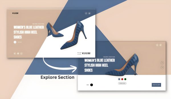
This is a contemporary, interactive product showcase page for the luxury brand of women’s high heel shoes “KUUM”. The page utilizes smooth animations, transitions of color, and an explore mode to modify the layout.
Project Structure
Before we begin, create the following file structure:
luxury shoe website/
│
├── index.html
├── style.css
├── script.js
└── images/
├── heel1.png
├── heel2.png
└── logo.png
🧱 Step 1: Creating the Navbar
<div class=”navbar”>
<div class=”logo”><img src=”images/logo.png” alt=”Logo”></div>
<div class=”nav-icons icons”>
<a href=”#”><i class=”ri-search-line”></i></a>
<a href=”#”><i class=”ri-shopping-bag-line”></i></a>
</div>
</div>
- A fixed position navbar is placed the top.
- It includes a logo and two icons (search, shopping bag).
- uses Remix Icons are used for the icons.
🧱 Step 2: Background Shapes;
.brown-bg, .blue-bg {
position: absolute;
z-index: 1;
transition: all 1s ease;
}
- Two colored background shapes (brown, blue)
- Why use clip-path? The clip-path property is used to create complex shapes by defining a clipping region.
- bennettfeely.com/clippy/ is a tool to help visually create clip-path values.
- The shapes animate into view on initial page load
- Transform during explore mode.
🧱 Step 3: Hero Section
Hero Text
<div class=”hero-text”>
<h5>WELCOME LUXOUR KUUM</h5>
<h1>WOMEN’S BLUE LEATHER STYLISH HIGH HEEL SHOES</h1>
<button class=”btn explore-btn” id=”exploreBtn”>…</button>
</div>
- A heading for the main product
- A description of the heading
- An animated explore button with hover
Shoe Images
<div class=”shoe-images”>
<img src=”images/heel1.png” alt=”” class=”heel1″>
<img src=”images/heel2.png” alt=”” class=”heel2″>
</div>
- Two shoe images are conveniently placed
- "heel1" has been made larger and rotated in place
- "heel2" is set smaller and behind "heel1"
- Transformations occur during explore mode
Footer Info
<div class=”footer-info”>
<div class=”social icons”>…</div>
<div class=”shoe-info”>…</div>
</div>
- Social media icons (Twitter, Instagram, and Facebook)
- Social media information section for the brand
🧱 Step 4: Explore Panel
<div class=”explore-panel”>
<div class=”color-boxes”>
<div class=”color blue active”></div>
<div class=”color red”></div>
<div class=”color yellow”></div>
</div>
<div class=”price”>23000.00$</div>
</div>
- Color selection options
- Product pricing display
- Default hidden, appears in explore mode
🧱 Step5: Footer Buttons
<div class=”footer-buttons”>
<button class=”btn back-btn” id=”backBtn”>BACK</button>
<button class=”cart-btn”>ADD TO CART</button>
</div>
- Back button to exit explore mode
- Add to cart button
- Default hidden, appears in explore mode.
🧱 Step6: CSS Elements
Main CSS Techniques:
- CSS Variables for theming consistency
- Flexbox & Grid for layouts
- CSS Transitions & Animations for smooth transitions
- Clip-path for custom shapes
- Transform for positioning elements
- Filter effects including drop-shadow
- Backdrop-filter for glass morphism effect
Noteworthy CSS Classes:
- ".explore-active" - Main class that triggers layouts to change
- Custom button animations with expanding circles
- All positionings are responsive with absolute and fixed positioning.
- Hover effects for all interactive elements
🧱 Step7: JavaScript Functionality
const body = document.body;
const exploreBtn = document.getElementById(“exploreBtn”);
const backBtn = document.getElementById(“backBtn”);
exploreBtn.addEventListener(“click”, () => {
body.classList.add(“explore-active”);
});
backBtn.addEventListener(“click”, () => {
body.classList.remove(“explore-active”);
});
- Simple toggle functionality with normal mode and explore mode.
- The "explore-active" class is added/removed to the body element.
- CSS makes all visual changes when that class is present.
Key Interactive Elements:
1. Explore Mode Transition – Clicking “EXPLORE” completely transitions the layout
2. Animated Buttons – Custom arrow buttons with hover effects
3. Color selection – Interactive color swatches
4. Smooth animations – Everything is powered by CSS transitions
5. Layout Transitions – Backgrounds, images, and elements all shift position
This code creates a premium, magazine-like shopping experience with intricate animations, finessed high design principles.
Related Post
Design Synth
Welcome to Design Synth! Enter the world of web design, where art meets code. Find awesome designs, practice new techniques, and churn out stunning digital experiences that excite and engage an audience.
Popular Posts

Explore Topics

- Card Design (4)
- Carousel (2)
- CSS and HTML (10)
- Design Synth (11)
- Form Designs (1)
- GSAP (4)
- Header Design (8)
- Hover Effect (4)
- JavaScript (9)
- Navbar Designs (4)
- Parallax (1)
- Slider Designs (2)
- Template Designs (3)
- WordPress (1)
Tag Clouds

- Animation Effects
- Animation Image
- Animation Text
- AOS Animation
- Button
- Card Design
- Cards Design
- Carousel
- Code Tutorials
- Creative Web Templates
- CSS and HTML
- Design Synth
- Effect Image
- Effect Scroll
- Form Design
- Form Designs
- Free Website Template
- Front-End Design
- Glassmorphism Design
- GSAP Animation
- Halloween
- Header Design
- Hover Effects
- HTML
- HTML CSS Projects
- JavaScript
- JS
- Modern Website Design
- Navbar Design
- Navbar Designs
- Parallax Effect
- Parallax Scroll CSS
- Plane Website
- Responsive
- Responsive Design
- Slider Design
- Slider Designs
- SVG
- Tailwind CSS
- Template Designs
- UI Design
- UX Design
- Web Design
- Web Development
- Website Templates
- WordPress Website

Overview
This is a contemporary, interactive product showcase page for the luxury brand of women’s high heel shoes “KUUM”. The page utilizes smooth animations, transitions of color, and an explore mode to modify the layout.
Project Structure
Before we begin, create the following file structure:
luxury shoe website/
│
├── index.html
├── style.css
├── script.js
└── images/
├── heel1.png
├── heel2.png
└── logo.png
🧱 Step 1: Creating the Navbar
<div class=”navbar”>
<div class=”logo”><img src=”images/logo.png” alt=”Logo”></div>
<div class=”nav-icons icons”>
<a href=”#”><i class=”ri-search-line”></i></a>
<a href=”#”><i class=”ri-shopping-bag-line”></i></a>
</div>
</div>
- A fixed position navbar is placed the top.
- It includes a logo and two icons (search, shopping bag).
- uses Remix Icons are used for the icons.
🧱 Step 2: Background Shapes;
.brown-bg, .blue-bg {
position: absolute;
z-index: 1;
transition: all 1s ease;
}
- Two colored background shapes (brown, blue)
- Why use clip-path? The clip-path property is used to create complex shapes by defining a clipping region.
- bennettfeely.com/clippy/ is a tool to help visually create clip-path values.
- The shapes animate into view on initial page load
- Transform during explore mode.
🧱 Step 3: Hero Section
Hero Text
<div class=”hero-text”>
<h5>WELCOME LUXOUR KUUM</h5>
<h1>WOMEN’S BLUE LEATHER STYLISH HIGH HEEL SHOES</h1>
<button class=”btn explore-btn” id=”exploreBtn”>…</button>
</div>
- A heading for the main product
- A description of the heading
- An animated explore button with hover
Shoe Images
<div class=”shoe-images”>
<img src=”images/heel1.png” alt=”” class=”heel1″>
<img src=”images/heel2.png” alt=”” class=”heel2″>
</div>
- Two shoe images are conveniently placed
- "heel1" has been made larger and rotated in place
- "heel2" is set smaller and behind "heel1"
- Transformations occur during explore mode
Footer Info
<div class=”footer-info”>
<div class=”social icons”>…</div>
<div class=”shoe-info”>…</div>
</div>
- Social media icons (Twitter, Instagram, and Facebook)
- Social media information section for the brand
🧱 Step 4: Explore Panel
<div class=”explore-panel”>
<div class=”color-boxes”>
<div class=”color blue active”></div>
<div class=”color red”></div>
<div class=”color yellow”></div>
</div>
<div class=”price”>23000.00$</div>
</div>
- Color selection options
- Product pricing display
- Default hidden, appears in explore mode
🧱 Step5: Footer Buttons
<div class=”footer-buttons”>
<button class=”btn back-btn” id=”backBtn”>BACK</button>
<button class=”cart-btn”>ADD TO CART</button>
</div>
- Back button to exit explore mode
- Add to cart button
- Default hidden, appears in explore mode.
🧱 Step6: CSS Elements
Main CSS Techniques:
- CSS Variables for theming consistency
- Flexbox & Grid for layouts
- CSS Transitions & Animations for smooth transitions
- Clip-path for custom shapes
- Transform for positioning elements
- Filter effects including drop-shadow
- Backdrop-filter for glass morphism effect
Noteworthy CSS Classes:
- ".explore-active" - Main class that triggers layouts to change
- Custom button animations with expanding circles
- All positionings are responsive with absolute and fixed positioning.
- Hover effects for all interactive elements
🧱 Step7: JavaScript Functionality
const body = document.body;
const exploreBtn = document.getElementById(“exploreBtn”);
const backBtn = document.getElementById(“backBtn”);
exploreBtn.addEventListener(“click”, () => {
body.classList.add(“explore-active”);
});
backBtn.addEventListener(“click”, () => {
body.classList.remove(“explore-active”);
});
- Simple toggle functionality with normal mode and explore mode.
- The "explore-active" class is added/removed to the body element.
- CSS makes all visual changes when that class is present.
Key Interactive Elements:
1. Explore Mode Transition – Clicking “EXPLORE” completely transitions the layout
2. Animated Buttons – Custom arrow buttons with hover effects
3. Color selection – Interactive color swatches
4. Smooth animations – Everything is powered by CSS transitions
5. Layout Transitions – Backgrounds, images, and elements all shift position
This code creates a premium, magazine-like shopping experience with intricate animations, finessed high design principles.
Related Post
Design Synth
Welcome to Design Synth! Enter the world of web design, where art meets code. Find awesome designs, practice new techniques, and churn out stunning digital experiences that excite and engage an audience.
Popular Posts

Explore Topics

- Card Design (4)
- Carousel (2)
- CSS and HTML (10)
- Design Synth (11)
- Form Designs (1)
- GSAP (4)
- Header Design (8)
- Hover Effect (4)
- JavaScript (9)
- Navbar Designs (4)
- Parallax (1)
- Slider Designs (2)
- Template Designs (3)
- WordPress (1)
Tag Clouds

- Animation Effects
- Animation Image
- Animation Text
- AOS Animation
- Button
- Card Design
- Cards Design
- Carousel
- Code Tutorials
- Creative Web Templates
- CSS and HTML
- Design Synth
- Effect Image
- Effect Scroll
- Form Design
- Form Designs
- Free Website Template
- Front-End Design
- Glassmorphism Design
- GSAP Animation
- Halloween
- Header Design
- Hover Effects
- HTML
- HTML CSS Projects
- JavaScript
- JS
- Modern Website Design
- Navbar Design
- Navbar Designs
- Parallax Effect
- Parallax Scroll CSS
- Plane Website
- Responsive
- Responsive Design
- Slider Design
- Slider Designs
- SVG
- Tailwind CSS
- Template Designs
- UI Design
- UX Design
- Web Design
- Web Development
- Website Templates
- WordPress Website

Overview
This is a contemporary, interactive product showcase page for the luxury brand of women’s high heel shoes “KUUM”. The page utilizes smooth animations, transitions of color, and an explore mode to modify the layout.
Project Structure
Before we begin, create the following file structure:
luxury shoe website/
│
├── index.html
├── style.css
├── script.js
└── images/
├── heel1.png
├── heel2.png
└── logo.png
🧱 Step 1: Creating the Navbar
<div class=”navbar”>
<div class=”logo”><img src=”images/logo.png” alt=”Logo”></div>
<div class=”nav-icons icons”>
<a href=”#”><i class=”ri-search-line”></i></a>
<a href=”#”><i class=”ri-shopping-bag-line”></i></a>
</div>
</div>
- A fixed position navbar is placed the top.
- It includes a logo and two icons (search, shopping bag).
- uses Remix Icons are used for the icons.
🧱 Step 2: Background Shapes;
.brown-bg, .blue-bg {
position: absolute;
z-index: 1;
transition: all 1s ease;
}
- Two colored background shapes (brown, blue)
- Why use clip-path? The clip-path property is used to create complex shapes by defining a clipping region.
- bennettfeely.com/clippy/ is a tool to help visually create clip-path values.
- The shapes animate into view on initial page load
- Transform during explore mode.
🧱 Step 3: Hero Section
Hero Text
<div class=”hero-text”>
<h5>WELCOME LUXOUR KUUM</h5>
<h1>WOMEN’S BLUE LEATHER STYLISH HIGH HEEL SHOES</h1>
<button class=”btn explore-btn” id=”exploreBtn”>…</button>
</div>
- A heading for the main product
- A description of the heading
- An animated explore button with hover
Shoe Images
<div class=”shoe-images”>
<img src=”images/heel1.png” alt=”” class=”heel1″>
<img src=”images/heel2.png” alt=”” class=”heel2″>
</div>
- Two shoe images are conveniently placed
- "heel1" has been made larger and rotated in place
- "heel2" is set smaller and behind "heel1"
- Transformations occur during explore mode
Footer Info
<div class=”footer-info”>
<div class=”social icons”>…</div>
<div class=”shoe-info”>…</div>
</div>
- Social media icons (Twitter, Instagram, and Facebook)
- Social media information section for the brand
🧱 Step 4: Explore Panel
<div class=”explore-panel”>
<div class=”color-boxes”>
<div class=”color blue active”></div>
<div class=”color red”></div>
<div class=”color yellow”></div>
</div>
<div class=”price”>23000.00$</div>
</div>
- Color selection options
- Product pricing display
- Default hidden, appears in explore mode
🧱 Step5: Footer Buttons
<div class=”footer-buttons”>
<button class=”btn back-btn” id=”backBtn”>BACK</button>
<button class=”cart-btn”>ADD TO CART</button>
</div>
- Back button to exit explore mode
- Add to cart button
- Default hidden, appears in explore mode.
🧱 Step6: CSS Elements
Main CSS Techniques:
- CSS Variables for theming consistency
- Flexbox & Grid for layouts
- CSS Transitions & Animations for smooth transitions
- Clip-path for custom shapes
- Transform for positioning elements
- Filter effects including drop-shadow
- Backdrop-filter for glass morphism effect
Noteworthy CSS Classes:
- ".explore-active" - Main class that triggers layouts to change
- Custom button animations with expanding circles
- All positionings are responsive with absolute and fixed positioning.
- Hover effects for all interactive elements
🧱 Step7: JavaScript Functionality
const body = document.body;
const exploreBtn = document.getElementById(“exploreBtn”);
const backBtn = document.getElementById(“backBtn”);
exploreBtn.addEventListener(“click”, () => {
body.classList.add(“explore-active”);
});
backBtn.addEventListener(“click”, () => {
body.classList.remove(“explore-active”);
});
- Simple toggle functionality with normal mode and explore mode.
- The "explore-active" class is added/removed to the body element.
- CSS makes all visual changes when that class is present.
Key Interactive Elements:
1. Explore Mode Transition – Clicking “EXPLORE” completely transitions the layout
2. Animated Buttons – Custom arrow buttons with hover effects
3. Color selection – Interactive color swatches
4. Smooth animations – Everything is powered by CSS transitions
5. Layout Transitions – Backgrounds, images, and elements all shift position
This code creates a premium, magazine-like shopping experience with intricate animations, finessed high design principles.
Related Post
Design Synth
Welcome to Design Synth! Enter the world of web design, where art meets code. Find awesome designs, practice new techniques, and churn out stunning digital experiences that excite and engage an audience.
Popular Posts

Explore Topics

- Card Design (4)
- Carousel (2)
- CSS and HTML (10)
- Design Synth (11)
- Form Designs (1)
- GSAP (4)
- Header Design (8)
- Hover Effect (4)
- JavaScript (9)
- Navbar Designs (4)
- Parallax (1)
- Slider Designs (2)
- Template Designs (3)
- WordPress (1)
Tag Clouds

- Animation Effects
- Animation Image
- Animation Text
- AOS Animation
- Button
- Card Design
- Cards Design
- Carousel
- Code Tutorials
- Creative Web Templates
- CSS and HTML
- Design Synth
- Effect Image
- Effect Scroll
- Form Design
- Form Designs
- Free Website Template
- Front-End Design
- Glassmorphism Design
- GSAP Animation
- Halloween
- Header Design
- Hover Effects
- HTML
- HTML CSS Projects
- JavaScript
- JS
- Modern Website Design
- Navbar Design
- Navbar Designs
- Parallax Effect
- Parallax Scroll CSS
- Plane Website
- Responsive
- Responsive Design
- Slider Design
- Slider Designs
- SVG
- Tailwind CSS
- Template Designs
- UI Design
- UX Design
- Web Design
- Web Development
- Website Templates
- WordPress Website


