🧭 Overview
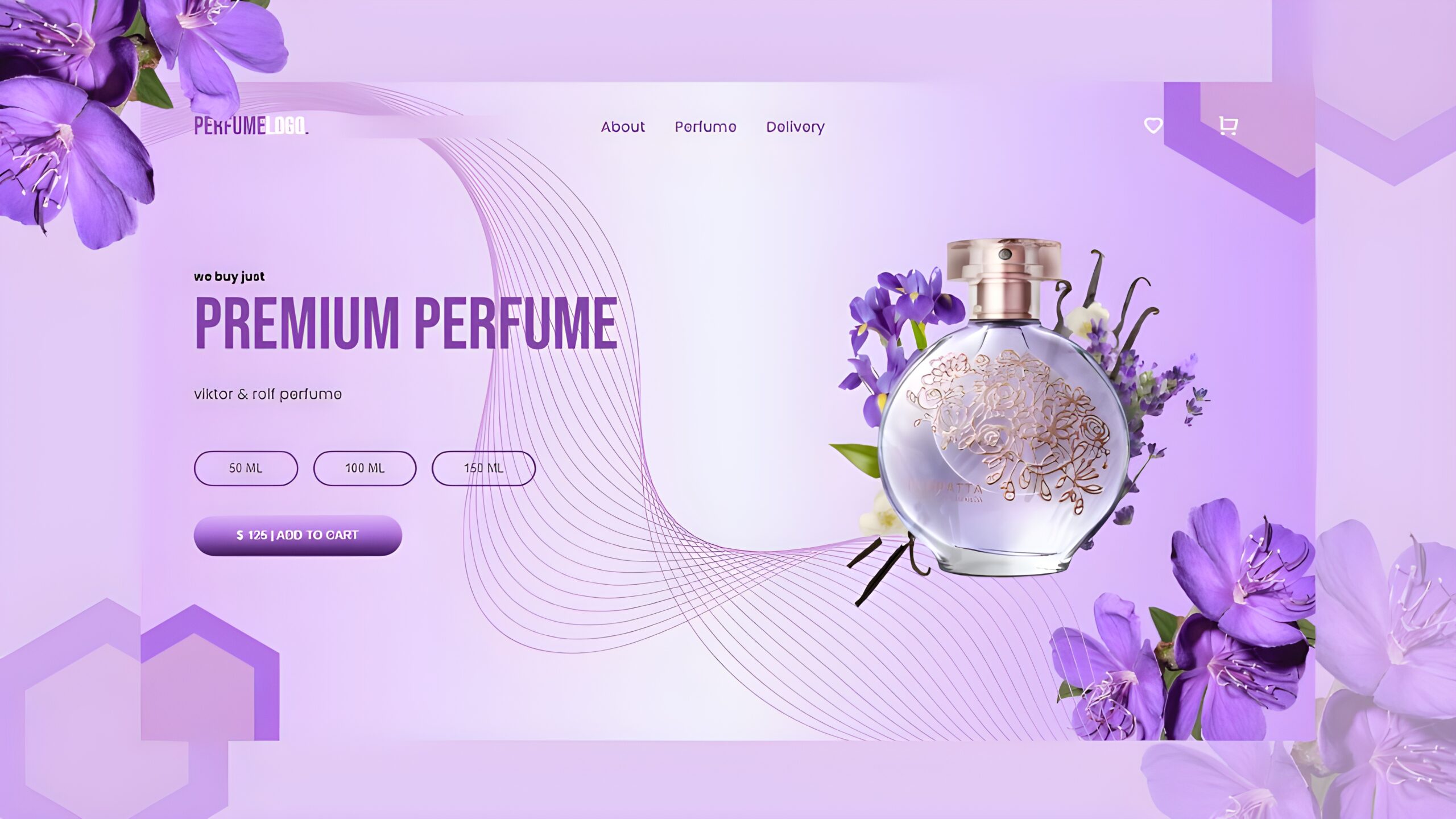
In this tutorial, you will learn how to make a mobile-friendly and modern Perfume Website with HTML, CSS and JavaScript. This design includes a fixed navigation bar, a cool hero section, buttons with a gradient, and smooth scroll animations with ScrollReveal.js.
By the end of this tutorial you will learn how to:
🧩 Project Files
Before we begin, create the following file structure:
perfume-website/
│
├── index.html
├── style.css
├── script.js
└── images/
├── hero.png
└── bg.png
🧱 Step 1: Creating the Navbar
The navbar includes the following:
🧱 Step 2: Creating the Hero Section
The hero section includes:
Use gradient backgrounds for buttons:
background-image: linear-gradient(180deg, #e1bbf7 0%, #af6de5 46%, #36104f 100%)
🧱 Step 3: Making It Responsive
To make your design look great on all devices:
@media (max-width: 768px) {
/* Adjust column stacking, font size, padding */
}
🧱 Step 4: Adding Scroll Animations
We will implement ScrollReveal.js to animate the elements when brought into view via scrolling.
1. Add ScrollReveal CDN
Paste this code before the closing tag:
<script src=”https://unpkg.com/scrollreveal”></script>
2. Add the animation script:
<script>
const scrollRevealOption = {
distance: “50px”,
origin: “bottom”,
duration: 1000,
};
ScrollReveal().reveal(“.header__image img”, { …scrollRevealOption, origin: “right” });
ScrollReveal().reveal(“.header__content h1”, { …scrollRevealOption, delay: 500 });
ScrollReveal().reveal(“.header__content p”, { …scrollRevealOption, delay: 1000 });
</script>
🧱 Step5: Adding JS for the Menu
Now we will have the mobile navigation menu open/close on a click.
<script>
const menuBtn = document.getElementById(“menu-btn”);
const navLinks = document.getElementById(“nav__links”);
const menuBtnIcon = menuBtn.querySelector(“i”);
menuBtn.addEventListener(“click”, () => {
navLinks.classList.toggle(“open”);
const isOpen = navLinks.classList.contains(“open”);
menuBtnIcon.setAttribute(“class”, isOpen ? “ri-close-line” : “ri-menu-line”);
});
</script>
💡 Note: This will toggle your navigation open and close smoothly on an icon switch.
")
")